Role:
User Experience Designer
Date:
Sept 2021 - Mar 2023
Tools:
Figma | Adobe Illustrator | Adobe Premiere

What is
MyManagement?
MyManagement is a portal designed for university students to access events, resources, and appointments in one centralized location. As of September, over 2,000 students are actively using MyManagement.
For this project, I contributed to the UX design and created all the graphic elements for the system, in addition to conducting user interviews with students.
Problem
The resources supporting the student experience were scattered across various platforms and websites. Consequently, Management students at the University of Toronto Scarborough lacked a centralized hub where they could access essential resources, such as upcoming campus events or a platform for booking academic and career counseling appointments.
End Results
I worked with the Development and Student Experience teams to create a platform that would make student experiences at the Faculty of Management easier and more streamlined. We fully launched MyManagement in September 2022.
It is currently being used by over 2000 Management student that attend the University of Toronto Scarborough.

Audit of Current Plaforms
To begin the process of designing this student portal, I conducted research of all the existing students platforms that existed for UTSC Management students to acknowledge the gaps in the student experience.
ACORN
Main Use: For academic and financial planning documents and resources.
Benefits: Central hub for all U of T students to access timetables and financial payments and student loan information.
Fallbacks: The student life section does not have information on department specific information.
CSM
Main Use: For CO-OP program resources and placements.
Benefits: Hub to access job board and CO-OP employment resources.
Fallbacks: This portal is only accessible by students in the CO-OP program.
Quercus
Main Use: For individual course schedule, quizzes and assignments.
Benefits: Allows students to access course information, quizzes and assignments and contact instructors.
Fallbacks: Platform only involves academic information and not other student life resources.
CLNx
Main Use: For career and volunteering opportunities.
Benefits: Central hub for all U of T students to access timetables and financial payments and student loan information.
Fallbacks: The student life section does not have information on department specific information.
User Interviews
To further explore the gap that existed in the current ecosystem of student platforms for U of T Scarborough Management students, I conducted interviews with students to discover how they felt about the current state of student platforms that are available to them.
Interviews consisted of 10 Management students in their first or second year
From the insights of the user interviews, it was clear that there was not one platform that met the user's needs, many users were not able to find pertinent information for their faculty because they did not know where to look.
Most users are unsure where to book an academic or career appointment
Most users will look at Instagram or the weekly newsletter on info about upcoming events.
It is difficult for users to find information about all the students clubs on campus
Users are unsure where to find information specifically for the Management faculty.
Structuring the system
To begin the design process, I worked with the Student experience team to establish the categories and pages that would be hosted on the student portal to best reflect student needs.

Designing the system the system
To begin the design process, I worked with the Student experience team to establish the categories and pages that would be hosted on the student portal to best reflect student needs.

To begin the design process, I worked with the Student experience team to establish the categories and pages that would be hosted on the student portal to best reflect student needs.

Guidelines and considerations
To begin the design process, I worked with the Student experience team to establish the categories and pages that would be hosted on the student portal to best reflect student needs.

To begin the design process, I worked with the Student experience team to establish the categories and pages that would be hosted on the student portal to best reflect student needs.

Usability testing
Before the launch of MyManagement, we conducted a series of user testing sessions with the preliminary version of the portal that the development team had created to gather student feedback about the system, to test if the navigation was user friendly, and to see what features were missing in the system.
Main objective: To test if students were able to easily find where to book an appointment, find an event, and access academic resources in the system.
A/B testing section: Should the student club leader's resources page be linked from the landing page (A) or from the Management club's page (B)? (students preferred option B because it was more relevant to the club's page)
10 students participated in user testing
Conclusion: We re-designed the Academics page with separate widgets for each resource type and consulted with faculty and work-study students to gather the most useful and relevant resources for students, to bring to the page.
Challenges
Communication with Developers
One issue we faced and was also brough up in user testing was that the widgets on the landing page were all different sizes because the text for each section were of different lengths.
Iteration one: The development team made the widgets all the same length but some of the descriptions in certain widgets was too long and required a scroll.
Iteration two: The length of the widgets were based on the longest description so that all the widgets could be the same length and did not required a scroll.
Solution
Prioritize communication with developers and create an effective way to communicate changes or bugs with developers.

Restructuring layout to incorporate additional information post-launch.
One issue we faced and was also brough up in user testing was that the widgets on the landing page were all different sizes because the text for each section were of different lengths.
Iteration one: The development team made the widgets all the same length but some of the descriptions in certain widgets was too long and required a scroll.
Iteration two: The length of the widgets were based on the longest description so that all the widgets could be the same length and did not required a scroll.
Solution
Group similar information together and test with users to ensure that they can intuitively find and navigate to the new information.
Create an information architecture framework like widget based layout that is adaptable to the growing and changing demands of the system.
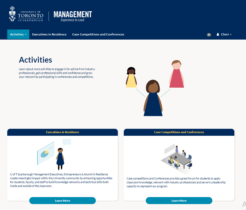
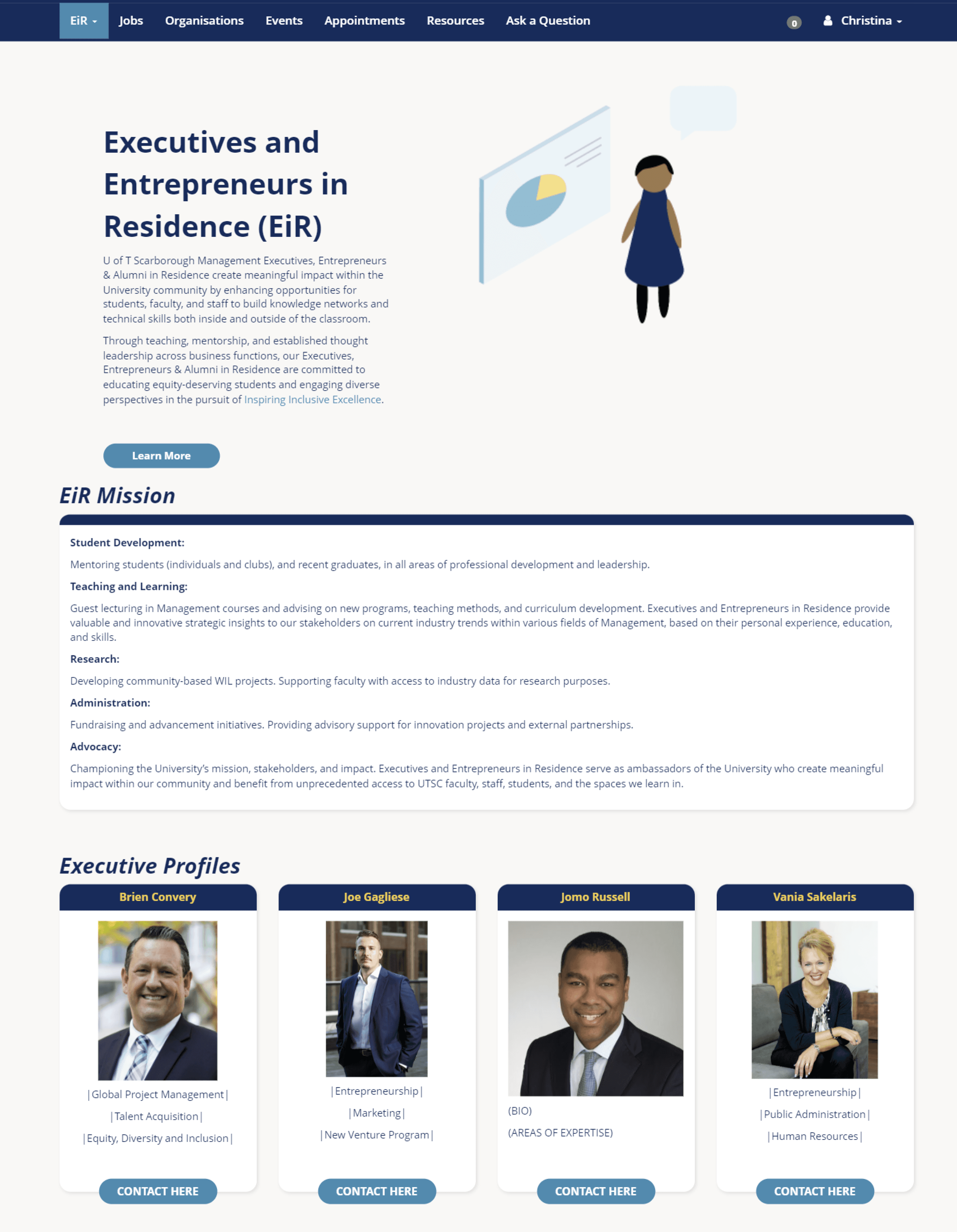
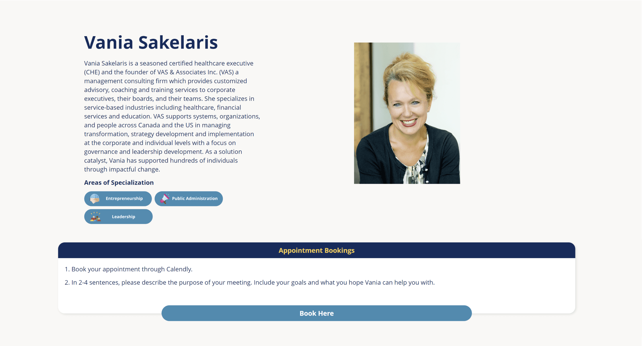
Executives in Residence
The Executives in Residence program allows students to have the opportunity to meet and talk to business executives and entrepreneurs who currently work in the industry. Theses executives have volunteered their time to help students getting started in their career. To qualify for this program, student need to fill out an intake form, which they would be determined eligible by department admin and then would go through a series of training videos before booking their appoint with an executive.
Workflow
The workflow is mapped out below to show the process a student would take to book an appointment with an executive.

Executive in Residence Pages
Reflection and learnings
Reflection interviews
After the first semester of the launch of MyManagement, I conducted users interviews again with students that were currently using the platform, to ask them about their experience with MyManagement.
17 Management students in different years and specializations.
8 open-ended questions
User Insights:
Main use case was for registering for events and booking appointments.
Top bar changes according to subsite which is confusing.
Some event dates are expired or too far in the future.
Would like to see more info about the BRIDGE and graduation.
Add both a calendar and list view for the 'Upcoming Events'.
Next steps
For the next steps of this project, I would make changes to MyManagement based on the feedback I received from the users, starting with addressing any bugs that exist on the current platform with the developers, then re-designing certain aspects of the platform such as the 'Upcoming Events' tab to better represent the user.
Learnings
It is important to gather feedback from all stakeholders to create a design that will balance the needs of all the people who use this system.
As users use the system more, their needs will change, which need to be reflected in the design of the system.
Role:
User Experience Designer
Date:
Sept 2021 - Mar 2023
Tools:
Figma | Adobe Illustrator | Adobe Premiere
What is MyManagement?
MyManagement is a portal designed for university students to access events, resources, and appointments in one centralized location. As of September, over 2,000 students are actively using MyManagement.
For this project, I contributed to the UX design and created all the graphic elements for the system, in addition to conducting user interviews with students.
Problem
The resources supporting the student experience were scattered across various platforms and websites. Consequently, Management students at the University of Toronto Scarborough lacked a centralized hub where they could access essential resources, such as upcoming campus events or a platform for booking academic and career counseling appointments.
End Results
I worked with the Development and Student Experience teams to create a platform that would make student experiences at the Faculty of Management easier and more streamlined. We fully launched MyManagement in September 2022.
It is currently being used by over 2000 Management student that attend the University of Toronto Scarborough.
Audit of Current Plaforms
To begin the process of designing this student portal, I conducted research of all the existing students platforms that existed for UTSC Management students to acknowledge the gaps in the student experience.
Main Use Case
Benefits
Fallbacks
ACORN
For academic and financial planning documents and resources.
Central hub for all U of T students to access timetables and financial payments and student loan information.
The student life section does not have information on department specific information.
CSM
For CO-OP program resources and placements.
Hub to access job board and CO-OP employment resources.
This portal is only accessible by students in the CO-OP program.
Quercus
For individual course schedule, quizzes and assignments.
Allows students to access course information, quizzes and assignments and contact instructors.
Platform only involves academic information and not other student life resources.
CLNx
For career and volunteering opportunities.
Central hub for all U of T students to access timetables and financial payments and student loan information.
The student life section does not have information on department specific information.
User Interviews
To further explore the gap that existed in the current ecosystem of student platforms for U of T Scarborough Management students, I conducted interviews with students to discover how they felt about the current state of student platforms that are available to them.
Interviews consisted of 10 Management students in their first or second year
From the insights of the user interviews, it was clear that there was not one platform that met the user's needs, many users were not able to find pertinent information for their faculty because they did not know where to look.
Most users are unsure where to book an academic or career appointment
Most users will look at Instagram or the weekly newsletter on info about upcoming events.
It is difficult for users to find information about all the students clubs on campus
Users are unsure where to find information specifically for the Management faculty.
Structuring the system
To begin the design process, I worked with the Student experience team to establish the categories and pages that would be hosted on the student portal to best reflect student needs.
Designing the system
To begin the design process, I worked with the Student experience team to establish the categories and pages that would be hosted on the student portal to best reflect student needs.
To begin the design process, I worked with the Student experience team to establish the categories and pages that would be hosted on the student portal to best reflect student needs.
Guidelines and considerations
To begin the design process, I worked with the Student experience team to establish the categories and pages that would be hosted on the student portal to best reflect student needs.
To begin the design process, I worked with the Student experience team to establish the categories and pages that would be hosted on the student portal to best reflect student needs.
Usability testing
Before the launch of MyManagement, we conducted a series of user testing sessions with the preliminary version of the portal that the development team had created to gather student feedback about the system, to test if the navigation was user friendly, and to see what features were missing in the system.
Main objective: To test if students were able to easily find where to book an appointment, find an event, and access academic resources in the system.
A/B testing section: Should the student club leader's resources page be linked from the landing page (A) or from the Management club's page (B)? (students preferred option B because it was more relevant to the club's page)
10 students participated in user testing
Conclusion: We re-designed the Academics page with separate widgets for each resource type and consulted with faculty and work-study students to gather the most useful and relevant resources for students, to bring to the page.
Challenges
Communication with Developers
One issue we faced and was also brough up in user testing was that the widgets on the landing page were all different sizes because the text for each section were of different lengths.
Iteration one: The development team made the widgets all the same length but some of the descriptions in certain widgets was too long and required a scroll.
Iteration two: The length of the widgets were based on the longest description so that all the widgets could be the same length and did not required a scroll.
Solution
Prioritize communication with developers and create an effective way to communicate changes or bugs with developers.
Restructuring layout to incorporate additional information post-launch.
One issue we faced and was also brough up in user testing was that the widgets on the landing page were all different sizes because the text for each section were of different lengths.
Iteration one: The development team made the widgets all the same length but some of the descriptions in certain widgets was too long and required a scroll.
Iteration two: The length of the widgets were based on the longest description so that all the widgets could be the same length and did not required a scroll.
Solution
Group similar information together and test with users to ensure that they can intuitively find and navigate to the new information.
Create an information architecture framework like widget based layout that is adaptable to the growing and changing demands of the system.
Executives in Residence
The Executives in Residence program allows students to have the opportunity to meet and talk to business executives and entrepreneurs who currently work in the industry. Theses executives have volunteered their time to help students getting started in their career. To qualify for this program, student need to fill out an intake form, which they would be determined eligible by department admin and then would go through a series of training videos before booking their appoint with an executive.
Workflow
The workflow is mapped out below to show the process a student would take to book an appointment with an executive.
Executive in Residence Pages
Reflection and learnings
Reflection interviews
After the first semester of the launch of MyManagement, I conducted users interviews again with students that were currently using the platform, to ask them about their experience with MyManagement.
17 Management students in different years and specializations.
8 open-ended questions
User Insights:
Main use case was for registering for events and booking appointments.
Top bar changes according to subsite which is confusing.
Some event dates are expired or too far in the future.
Would like to see more info about the BRIDGE and graduation.
Add both a calendar and list view for the 'Upcoming Events'.
Next steps
For the next steps of this project, I would make changes to MyManagement based on the feedback I received from the users, starting with addressing any bugs that exist on the current platform with the developers, then re-designing certain aspects of the platform such as the 'Upcoming Events' tab to better represent the user.
Learnings
It is important to gather feedback from all stakeholders to create a design that will balance the needs of all the people who use this system.
As users use the system more, their needs will change, which need to be reflected in the design of the system.
Role:
User Experience Designer
Date:
Sept 2021 - Mar 2023
Tools:
Figma | Adobe Illustrator | Adobe Premiere
What is MyManagement?
MyManagement is a portal designed for university students to access events, resources, and appointments in one centralized location. As of September, over 2,000 students are actively using MyManagement.
For this project, I contributed to the UX design and created all the graphic elements for the system, in addition to conducting user interviews with students.
Problem
The resources supporting the student experience were scattered across various platforms and websites. Consequently, Management students at the University of Toronto Scarborough lacked a centralized hub where they could access essential resources, such as upcoming campus events or a platform for booking academic and career counseling appointments.
End Results
I worked with the Development and Student Experience teams to create a platform that would make student experiences at the Faculty of Management easier and more streamlined. We fully launched MyManagement in September 2022.
It is currently being used by over 2000 Management student that attend the University of Toronto Scarborough.
Audit of Current Plaforms
To begin the process of designing this student portal, I conducted research of all the existing students platforms that existed for UTSC Management students to acknowledge the gaps in the student experience.
Main Use Case
Benefits
Fallbacks
ACORN
For academic and financial planning documents and resources.
Central hub for all U of T students to access timetables and financial payments and student loan information.
The student life section does not have information on department specific information.
CSM
For CO-OP program resources and placements.
Hub to access job board and CO-OP employment resources.
This portal is only accessible by students in the CO-OP program.
Quercus
For individual course schedule, quizzes and assignments.
Allows students to access course information, quizzes and assignments and contact instructors.
Platform only involves academic information and not other student life resources.
CLNx
For career and volunteering opportunities.
Central hub for all U of T students to access timetables and financial payments and student loan information.
The student life section does not have information on department specific information.
User Interviews
To further explore the gap that existed in the current ecosystem of student platforms for U of T Scarborough Management students, I conducted interviews with students to discover how they felt about the current state of student platforms that are available to them.
Interviews consisted of 10 Management students in their first or second year
From the insights of the user interviews, it was clear that there was not one platform that met the user's needs, many users were not able to find pertinent information for their faculty because they did not know where to look.
Most users are unsure where to book an academic or career appointment
Most users will look at Instagram or the weekly newsletter on info about upcoming events.
It is difficult for users to find information about all the students clubs on campus
Users are unsure where to find information specifically for the Management faculty.
Structuring the system
To begin the design process, I worked with the Student experience team to establish the categories and pages that would be hosted on the student portal to best reflect student needs.
Designing the system the system
To begin the design process, I worked with the Student experience team to establish the categories and pages that would be hosted on the student portal to best reflect student needs.
To begin the design process, I worked with the Student experience team to establish the categories and pages that would be hosted on the student portal to best reflect student needs.
Guidelines and considerations
To begin the design process, I worked with the Student experience team to establish the categories and pages that would be hosted on the student portal to best reflect student needs.
To begin the design process, I worked with the Student experience team to establish the categories and pages that would be hosted on the student portal to best reflect student needs.
Usability testing
Before the launch of MyManagement, we conducted a series of user testing sessions with the preliminary version of the portal that the development team had created to gather student feedback about the system, to test if the navigation was user friendly, and to see what features were missing in the system.
Main objective: To test if students were able to easily find where to book an appointment, find an event, and access academic resources in the system.
A/B testing section: Should the student club leader's resources page be linked from the landing page (A) or from the Management club's page (B)? (students preferred option B because it was more relevant to the club's page)
10 students participated in user testing
Conclusion: We re-designed the Academics page with separate widgets for each resource type and consulted with faculty and work-study students to gather the most useful and relevant resources for students, to bring to the page.
Challenges
Communication with Developers
One issue we faced and was also brough up in user testing was that the widgets on the landing page were all different sizes because the text for each section were of different lengths.
Iteration one: The development team made the widgets all the same length but some of the descriptions in certain widgets was too long and required a scroll.
Iteration two: The length of the widgets were based on the longest description so that all the widgets could be the same length and did not required a scroll.
Solution
Prioritize communication with developers and create an effective way to communicate changes or bugs with developers.
Restructuring layout to incorporate additional information post-launch.
One issue we faced and was also brough up in user testing was that the widgets on the landing page were all different sizes because the text for each section were of different lengths.
Iteration one: The development team made the widgets all the same length but some of the descriptions in certain widgets was too long and required a scroll.
Iteration two: The length of the widgets were based on the longest description so that all the widgets could be the same length and did not required a scroll.
Solution
Group similar information together and test with users to ensure that they can intuitively find and navigate to the new information.
Create an information architecture framework like widget based layout that is adaptable to the growing and changing demands of the system.
Executives in Residence
The Executives in Residence program allows students to have the opportunity to meet and talk to business executives and entrepreneurs who currently work in the industry. Theses executives have volunteered their time to help students getting started in their career. To qualify for this program, student need to fill out an intake form, which they would be determined eligible by department admin and then would go through a series of training videos before booking their appoint with an executive.
Workflow
The workflow is mapped out below to show the process a student would take to book an appointment with an executive.
Executive in Residence Pages
Reflection and learnings
Reflection interviews
After the first semester of the launch of MyManagement, I conducted users interviews again with students that were currently using the platform, to ask them about their experience with MyManagement.
17 Management students in different years and specializations.
8 open-ended questions
User Insights:
Main use case was for registering for events and booking appointments.
Top bar changes according to subsite which is confusing.
Some event dates are expired or too far in the future.
Would like to see more info about the BRIDGE and graduation.
Add both a calendar and list view for the 'Upcoming Events'.
Next steps
For the next steps of this project, I would make changes to MyManagement based on the feedback I received from the users, starting with addressing any bugs that exist on the current platform with the developers, then re-designing certain aspects of the platform such as the 'Upcoming Events' tab to better represent the user.
Learnings
It is important to gather feedback from all stakeholders to create a design that will balance the needs of all the people who use this system.
As users use the system more, their needs will change, which need to be reflected in the design of the system.